At Home Solutions, a home health care agency, needed its website to showcase the quality and professionalism of its care services.

The Client
At Home Solutions (AHS) is an NYC-based care services provider. They are a mid-sized company with five locations whose client base is primarily people who pay for their services through Medicare and Medicaid. They are hoping to expand their client base and attract more private-pay clients as well. AHS asked my team to help grow their user base and bring their web presence into the 21st century.
My Roles
UX Researcher
I spearheaded user interviews, moderated affinity mapping, facilitated the creation of a persona, constructed a user journey map, and designed and conducted usability tests.
UX Designer
I crafted mid-fi wireframes using Sketch and linked together prototypes in InVision.
Project Manager
I lead a team of 4 UX researchers/designers. I delegated tasks to other team members, oversaw the project backlog, and lead discussions regarding direction of design.
Timeline
2 weeks
The Problem
We hypothesized that users primarily go to the AHS website to read more about the agency and, if interested, request their services. However, when browsing the original website, users may be deterred from choosing AHS because of difficulties in navigating the website and finding the information they need. We believed that redesigning the website to be clear, comprehensive, and intuitive would complement the quality and professionalism of AHS and ultimately convince more clients to choose AHS.
How might we empower the user to make an informed decision in choosing a home health care agency?
RESEARCH

THE ORIGINAL AHS website

The Original Website Home Page Before Redesign
We utilized the following tools in our initial analysis of the original website:
Content Audit
We clicked through every page of the AHS website for a cursory look into what should be changed, removed, and added.
Heuristics Analysis
We used the Abby method to evaluate if the website was findable, accessible, clear, communicative, useful, credible, controllable, valuable, learnable, and delightful.
Competitive / Comparative Feature Analysis
We compared and contrasted the AHS website against 3 direct competitors (other home health care agencies based in NY) and 1 comparator (a NYC rehab/nursing center).
This preliminary research demonstrated that:
Competitors keep users on the website by offering extra resources, like educational material if they are new to the concept of home healthcare services.
A home health care agency’s services are typically organized by diagnosis, but the original AHS website lacked this expected pattern of organization.
On the AHS website, the "Referral” form, through which users should be able to request services, was broken.
User Interviews
We conducted a total of 6 interviews: 5 with our target demographic (middle aged users who sought home health care services for a loved one) and 1 social worker (for her unique perspective).
“My father [who has Alzheimer’s Dementia] doesn’t socialize a lot, so I want someone who’s able to communicate with him in a way he understands.”
- Andrian
“[Caregivers] need to be honest, dependable, and kind.”
- Susan
“The most positive part of finding a good caregiver is knowing someone is taking care of my mom when she can’t do something on her own.”
- Sue
Some of Our Immediate Takeaways:
Users have to juggle caring for their loved one (usually a parent with progressing dementia), caring for their own children, and tending to their full-time jobs. They really need to obtain the assistance of a home caregiver!
Users want to ensure that their loved one receives quality care from someone they can trust.
Users want to know that their caregiver understands the unique needs of someone with their loved one’s condition (for example, the communication needs of someone with Alzheimer’s Dementia).
SYNTHESIS

Affinity Mapping

Affinity mapping helped us organize the insights we gleaned from our interviews.
What we found:
Users need to feel confident that their caregiver will be trustworthy, reliable, and compassionate.
Users rely mainly on word-of-mouth recommendations in finding a caregiver.
Users rarely browse home health care agency websites, as they base their decision more on personal recommendations (see above point), but the website is still seen as important for knowing how to contact the agency for services.
Searching for a caregiver can be an emotionally charged process — users would much rather speak to a human than fill out a form when requesting services.
Persona

Our persona represents the average user attempting to obtain home healthcare services for a loved one.
User Journey Map

This user journey map helped us empathize with Nancy (our persona), and highlight opportunities.
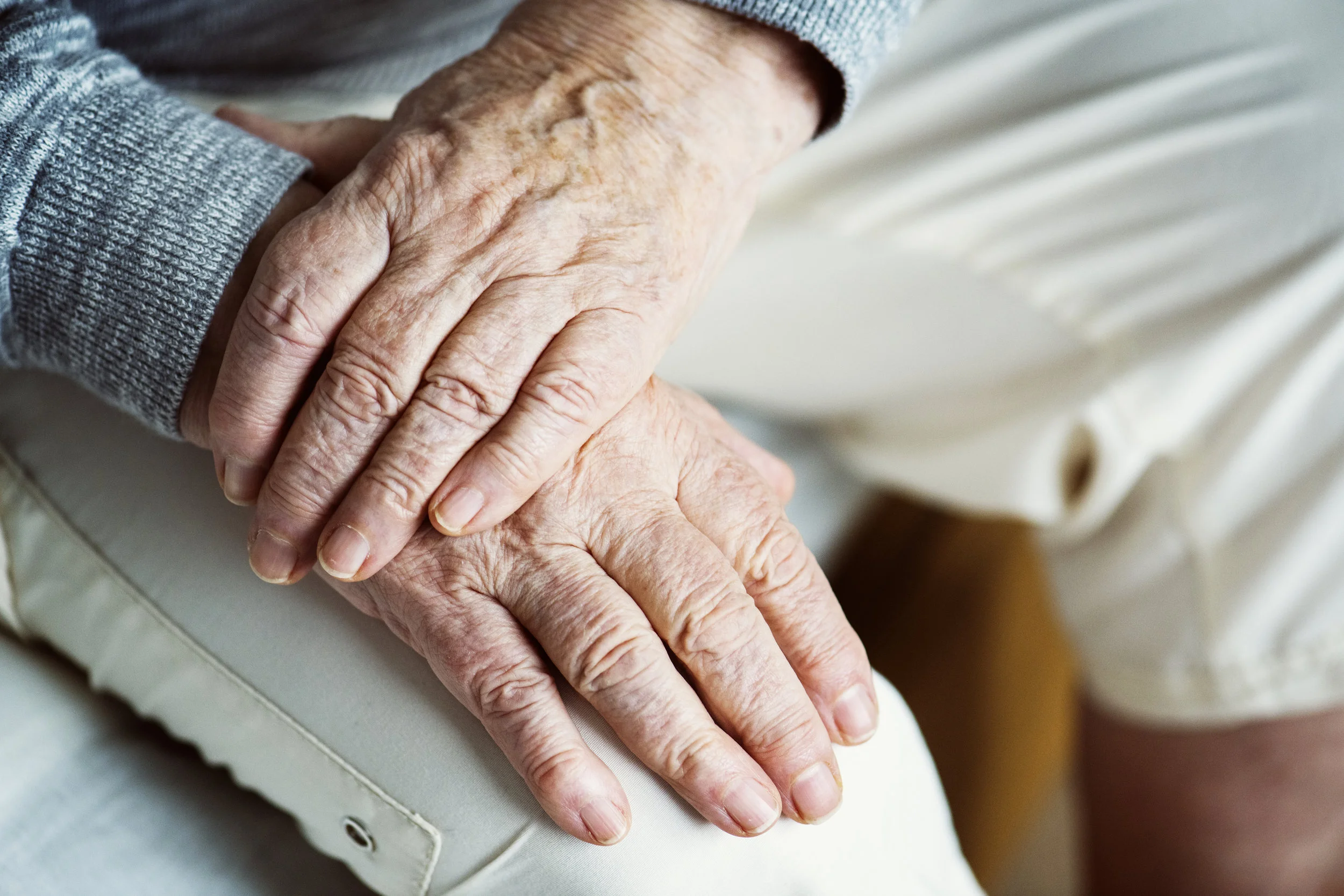
In summary, we needed a website that would be easy to use by an older user base (50s and older), and it would need to have a personal, human touch that conveys trustworthiness, compassion, and professionalism.
IDEATION

MOBILE FIRST DESIGN
AHS showed us their previous research, which demonstrated that a majority of users using their website were on their mobile devices. Using this information, and going by UX best practices, we approached the design with a mobile-first mentality: we first optimized the usability of the website for mobile devices, then translated the design to a desktop version.
DESIGN STUDIO
We independently sketched ideas for the website redesign, then regrouped to discuss what worked best in each of our sketches. We ultimately adopted a design that adopted the best of our ideas.
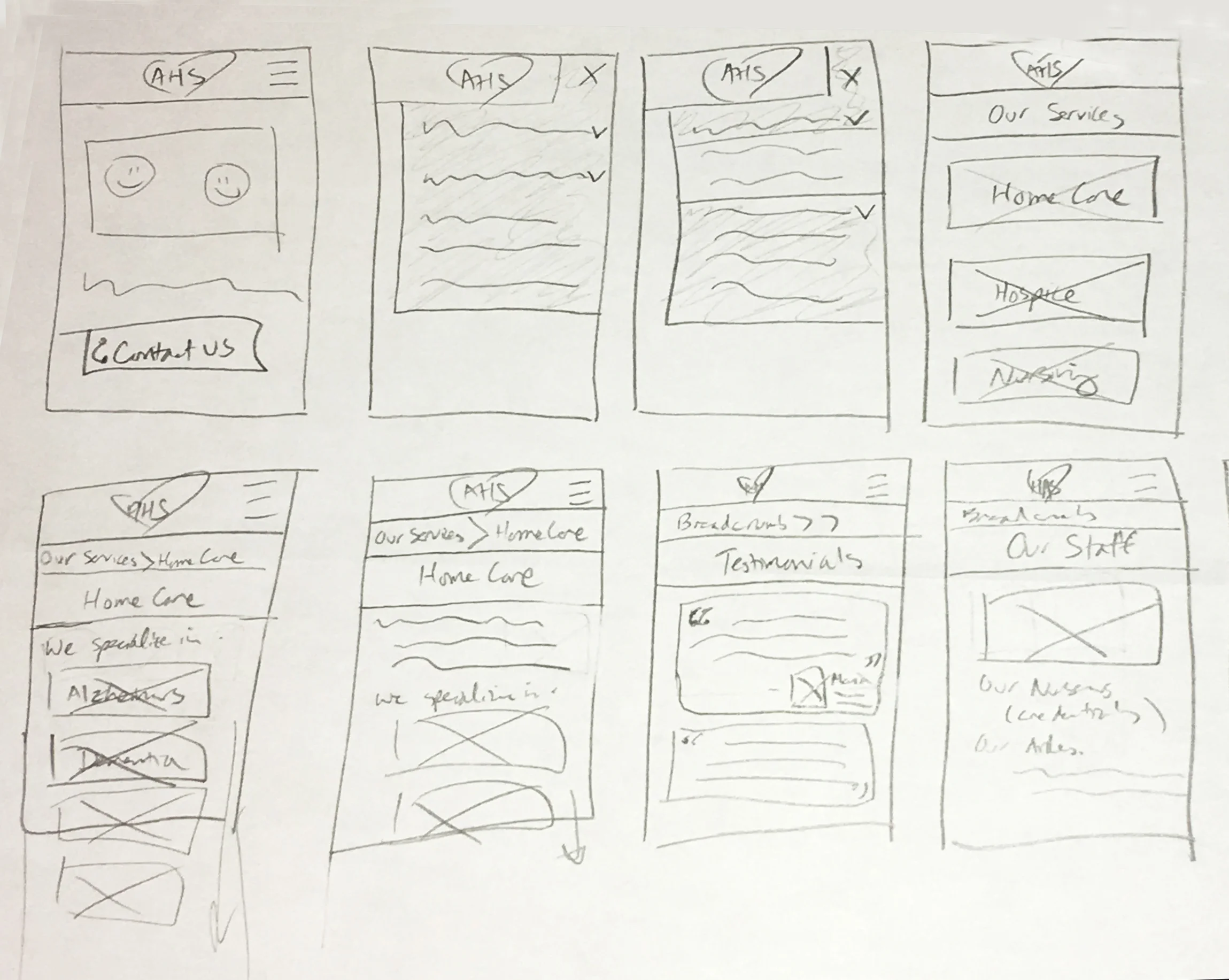
Examples of my own sketches, including the idea of a Testimonials page and thoughts on how the mobile menu would work.
Some of the ideas we implemented into our design include:
Testimonials page
Research indicates that users rely heavily on word-of-mouth recommendations in deciding on a home healthcare agency.
Call Button
Users come to the page with a goal in mind: Requesting Services. They want to speak in real-time with a human being over the phone.
Caregiver Screening page
Our interview with our stakeholders demonstrated that AHS has a whole screening process when hiring caregivers. AHS should highlight this process, as it emphasizes how serious AHS is about the quality and professionalism of the care they provide.
ITERATION
USABILITY TESTING
We conducted a total of 4 rounds of usability testing, with 4-5 users per round. Adjustments to our design were made based on feedback in order to improve the usability and intuitiveness of the website. The layout, navigation items, and nomenclature considerably evolved throughout testing.
Where do users expect to find testimonials?
Usability testing confirmed that users expect and want to read testimonials…if they could find them.
Early testing demonstrated that users had difficulty finding the Testimonials page. Our team had conducted card sorting/tree testing prior to creating our wireframes, but the results regarding Testimonials were ambiguous.

Where should the Testimonials page live?
ROUND 1
Testimonials under About Us - users had a 100% error rate in finding Testimonials, either going to other categories like Services or not finding it altogether.
ROUND 2
We created a new category called “Why AHS?” but with no improvement in results.
ROUND 3
Ultimately, Testimonials found its own place in the menu, resulting in 100% completion rate and 0% error rate.
Scrolling through testimonials
WHERE IS THE MOST INTUITIVE POSITION FOR A CALL BUTTON?
Per our research, users want to speak about their own unique personal circumstances with a live human being. Based on this insight and competitive analysis, we knew we needed to have a call button that allows users to quickly and easily request services, which is their main goal. But where should this button go?
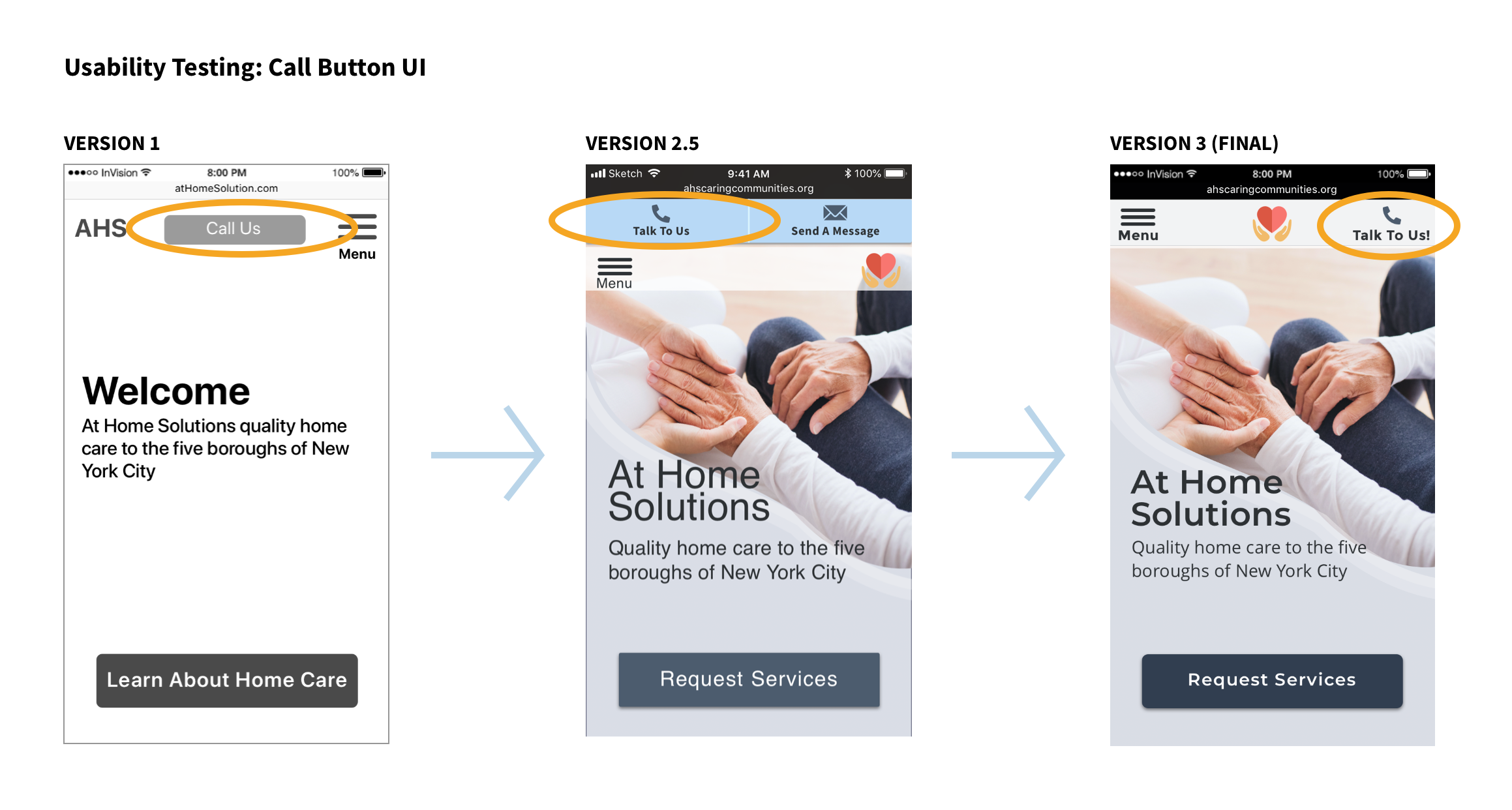
Where should the call button go?
ROUND 1
Only about half of users immediately noticed the call button. We also received some feedback that the button was a bit too small to press.
ROUND 2
We made the button larger, but also toyed with the idea of placing both a call button and a Send Message button above the main navigation bar. Users instead found AHS’s phone number through the Contact Us page rather than the convenient button - they now tended to overlook the buttons.
ROUND 3
Ultimately, we focused on only the call button and removed the Send Message button — users prefer speaking live with a human after all. The call button moved back to the main navigation bar, which tested well (100% completion, 0% error rate).
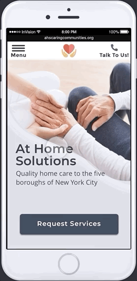
Talk to someone at AHS at the touch of a button.
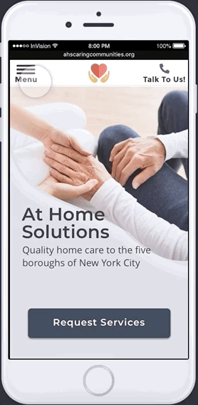
FINAL PROTOTYPES


NEXT STEPS
We made the following recommendations to At Home Solutions:
Hire a copywriter to flesh out the content of the pages and keep the language appropriately professional and compassionate
Ensure that the developer codes the website to be fully responsive (viewable in both mobile and desktop versions)
Use only professional quality photographs (the stock photos, if used in the final website, would need to be purchased)